Greetings, friends!
In the third and also final part of our blog posts about the updates, we will try to cover all that we did not get a chance to tell you about in the first or second part.
General list
Why do we call it a general list? The answer to that question is the following: it now searches through all the lists of My menu. You can momentarily find a task, Project, Bookmark or a Person by entering just a part of a title or several letters of a name.
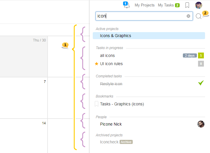
- In the picture above, when searching for «icon», matches in the following groups show up: Active Projects /Tasks in progress / Closed tasks / Bookmarks / People / Archive
- If you need to search in the texts of task description, comments, and file names, — click on the magnifying glass or click ⌘ enter or ctrl enter, and it will lead you to the page of Advanced search with which you are already familiar.
Just a reminder! In order to focus the cursor in the search form without the click of a mouse, use the Alt F key combination
Please note! On some pages of the account, there is a Context search by the visible content. For example, in such sections as People, Tasks, Projects, Files. If you would like to use the General search on the pages that has the Context search — just click on the round cross button in the right part of the form.

Even if you forgot to deselect the Context search and entered the search, again, nothing to worry about — in order to switch to the General Search, just click enter, and in order to switch to the Advanced Search, click ctrl enter or click on the Magnifying Glass icon.
Adding pretty much anything with the Green Plus button
Dear friends, now everything that you can create in the account is in the combined Green Plus button. The Green Plus button is where you can find Create Task, Subtask (from the task’s page), Projects and Invitation to People. And if you are in a task or a subtask, then you will also be able to create nested subtasks.
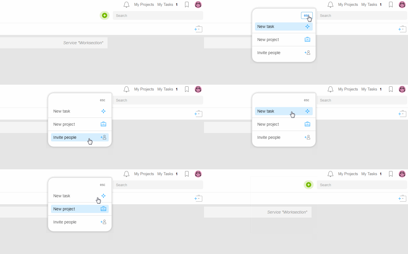
How to switch to the «create task» option right away?
If you wish to create a task right away skipping the drop-down menu, then instead of clicking once, use a double click or click while holding down the shift key.
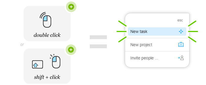
Besides, switching to the «create task» option is available by clicking AltN as before.
New On the full-scale task creation page, there is now an option to change Project and level of nesting of the task during the process of task creation.

In other words, when starting to create a task in one project, you can change its location and make it a subtask of another project without ever leaving the page from which you started.
Quick addition of tasks and subtasks
In the Subtasks list (right column on the Tasks page) and on the Tasks by People page, there now exists an option to quickly add tasks «on the spot, in one line». This option will be useful for those who set numerous tasks without description or describes the task in the comments section.
How does it work?

- «Add Subtask» button
- Blank form for the subtask’s title. You can also set a priority and choose the executive
- The subtask that has just been added has a blue countdown timer
Why is the blue countdown timer there?
Tasks that have been created by adding in one line are not published right away (by default). The blue countdown timer shows how much time is left before the task is published, notifications are sent, and all the project participants will see it in the system.
Such delay (3 minutes by default) provides an opportunity to fix possible mistakes, add tags, deadlines without leaving the page. You can set the delay by default in your profile (1, 3 or 5 minutes) or completely turn it off.
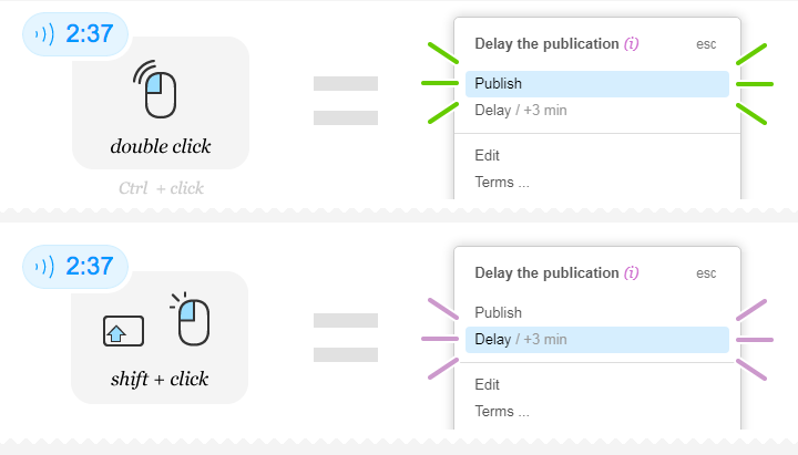
Besides the informational component, the blue countdown timer has a number of functional opportunities. Click on it while it counts the time down, and you will see the following menu:
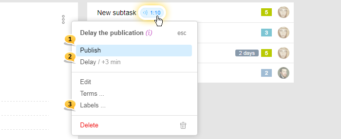
- Publish the task now (Double-click or ⌘+click)
- Delay publication for three minutes (or Shift+click)
- Also, set Timeframes and Tags, edit in the full-scale format or Delete
Double-click on the blue timer will lead to the instant publication while click with the shift key held down will increase the delay by 3 minutes.
How do I switch to Creating a Task right away?
If you wish to add subtasks with descriptions — use the Green Plus or double-click on the subtask addition button.
Advice if you clicked on the form of one-line task adding and then decided to use the full scale, then just click enter in the blank form!
Even if you’ve already typed in the title and then decided to use the full scale format, then click on the following icon.

New commenting option in the View Mode and a small Markdown
Dear friends, finally you can use the shortened version of a comment to its maximum since now you have access to all the functionality of the full scale commenting.
You can use image insert from clipboard, @mention, enter links for tasks via #. But this is not all
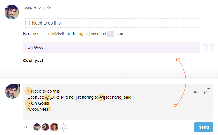
We’ve enabled a small Markdown layout. It means that now you can format your text without the visual editor and just by using special symbols:
- + — start the line with a plus and it will become a «to do list» after the publication
- - — start the line with a minus and it will turn into a regular list
- *bold* — surround your text with * and it will become bold
- _italic_ — surround your text by _ and it will be italicized
- > — start the line with > and it will become a quote
- @ — for mentioning a team member
- # — for links to other task
To make it more visual, take a look how the text from the shortened commenting form will look like after the publication when using the layout:
All of these wonderful layout features are available when writing comments from your phone or Telegram.
When using the full scale commenting format (with visual editor), we’ve also added a feature of creating to-do lists, lists and quotes from keyboard. In order to do this, use Alt and + - * / on the digital keyboard:
- Altnum + — to do list
- Altnum - — numerical list
- Altnum * — marked list
- Altnum / — quote
Tab change
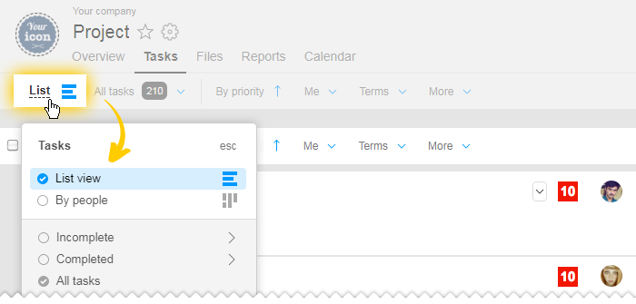
The header part became much more compact partly due to us removing the tabs within the sections of Tasks, Reports and others.
All that was there in tabs is now available on the filter panel to the left. For example, the tab change for tasks looks the following way:
In the Reports section, the tab change looks like this:
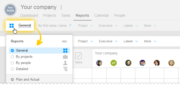
Please note that in order to switch to the report by Day, first choose the By People or By Project report type. To the right, there is now a switch to the By day view.

Pathway to the Task
Now, no matter which subtask you are in, you will always understand its exact position in the hierarchy. At the very top of the page under the title, now there’s a pathway to the Task.
In the picture below, it can be seen what will happen if you click on each of the elements of the pathway using the right click or the left click
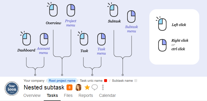
The right-click is available only in the full-scale format and is not available in the modal windows of task views
Since we started talking about the right-click, it is time to remind what wonderful things can be done by simple double-clicking
Double-click allows:
- Double click on Three dots of a task or a comment — switch to editing
- Double click on the Green Plus adds/ creates anything you need or Blue Plus adds subtasks — switch to full-scale creation of tasks
- Double-click on Timer — Stop / Start
- Double-clicking on the Blue Timer allows delay of the publication — instant publication
Photos and list of Files
All the big pictures now have preview of the maximum width of 1920 px, which is what is being shown during the preview. This has been created to speed up the work on a mobile device. All uploaded files are there in its original form when clicking on the picture in a new window, and, of course, when downloading.
Moreover, now there’s new view of the Project Files list:
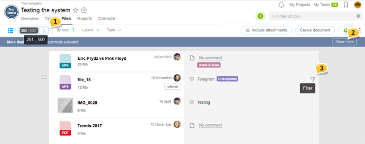
- Restriction of the number of displayed data. It helps with the work with large amounts of data. For example, there is a total of 2027 files; however, one page can show only 250 of them. Scrolling is possible right here new
- If you do not feel like scrolling, click on «show more».
- In the Files section now there is an option of viewing all the files of one specific task. Click on the funnel. You also can do it from the Task menu > More > All Task Files new
Updates in the comment feed
For more interactive communication within a task, we’ve created auto-upload of the new data in the comment feed. You no longer need to update the page in order to see the new comment, reaction or done to do list for today.
Completing to-do list contain more useful information now. The color in the checkbox allows to see when a certain element of the list was closed:

Hover your cursor on the checkbox, and you will learn when exactly it was created and by whom. Items on the to do list that have been re-opened is also showing who and when unchecked the Done box.
Have a productive work time,
Worksection Team
