
Hello, friends! We are approaching the finish line with introductions to our newbies.
Let’s start with the bulk operations panel that used to pop up at the bottom of the page. Now it has changed its location and moved upwards covering the filter panel. This will separate the process of sorting and filtering from the bulk actions. In other words, now you are filtering first and then proceed to marking the desired items and produce action with them. This way we have more space and less confusion.
Advice Removing the bulk operations menu and dropping all the marks can be done with the esc button.
View, sorting, and filter panels
We’ve gathered all of the possible page options in the first drop-down item View. You can access it with the help of hotkeys alt+V. Person responsible for the project and the author are now in the Me line. Timeframes left the Show section and are now in a separate filtering parameter. Everything else is now combined under More... Access to the expanded filter, export and other options are in the drop-down menu to the right.

Let’s take a look at an example of working with a task page using hotkeys:
Go to the Task page ⌘ alt+T. Enter the filter panel alt+V in the first menu View. With the right arrow go to Sort by, with the up/down arrows choose the desired item, then enter — done. This is how we changed the task sorting without the use of mouse.
Press Alt+↕ (up and down arrow) — «jump» on the task list. Move through the list with the help of the arrows ↕, marking the desired tasks with enter. When everything needed has been marked, press alt+V and you will end up in the bulk operations panel. Choose the desired action ↔ and press enter, and it’s done. And this is how you mark a group of task and produce action with a group without using a mouse.
Advice You can send a comment or implement changes made in the modal window by using ⌘+enter or ctrl+enter.
New filter ME
We’ve collected three key roles of each user in the new filter Me
 ME in charge — I am responsible for a task
 ME author — I set a task
 ME subscriber — I am a person who tracks progress and takes part

Of course, you can always choose another person instead of yourself and see tasks where this person is Responsible, Author or Subscriber.
If you wish to simultaneously see tasks of one author for another person who is in charge of a task or other combinations, please use the extended filter ( menu  ).
).
Applied ME filter looks like this:

1 — role change or switching to another team member
2 — filter reset
ME and My tasks
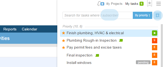
In the list of My tasks alt+T there’s also a role switch (ME) in the shape of an icon.
As a rule, a person in charge of a task is also its subscriber. Thus, if you switch from a «tasks with ME in charge  » to the «tasks to which I am subscribed
  », then you can get a quick access with alt+T not only to the tasks that you are in charge of but also those that you keep an eye on as a subscriber.
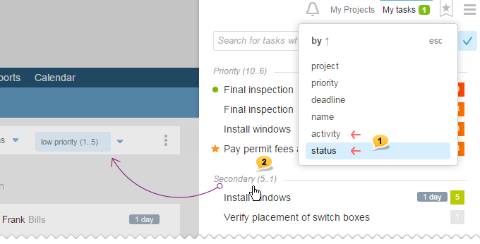
Moreover, now there are two new options to sort your task lists.
By status and By activity 1. Also, please note that every sorting type now has its dividers2. When clicking on them, it will forward you to the detailed page of all the account’s tasks that has been already filtered according to the parameters.
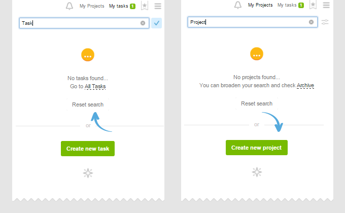
Quick search finds tasks among all the options of the ME filter!
For example, in the list of tasks with ME In charge, there are no tasks that will be responsive to the Push search. However, such task could be found among those to which I am subscribed.

If search by My tasks does not yield results, then you will be offered to discard it and create a new task with such name. This is quite convenient, and if you wish, you can use this trick as a starting point to create a new task or a project.
Advice You can quickly access My tasks not only with alt+T but also by simply clicking tab several times. Try it, it is convenient and does not require remembering keyboard shortcuts: you just «walk» on all of the dropdown lines of the Personal menu one by one using Tab.
My projects
Now there’s an option of switching to a more compact view, where projects are broken down not by main companies but just by two groups: In progress (up), Dormant (down). Also, projects marked with a star and projects managed by you move upwards. Such view allows us to keep all the important tasks at the top.
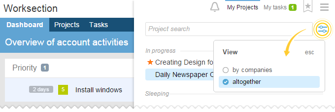
Reminder! Quick access to My projects can be done with the help of alt+P and by clicking TAB one or two times (if there are unread notifications in the bell, then the first click on Tab will open it, while the second click will open My projects (if the Bell is empty, then My projects are accessed after the first click).
Everything else is in one list.
new On the tasks page now there are avatars of people responsible for a project. If you click on them, it works as a filter. If you click on a name, it will open the window of changing a person in charge as before.
new Tasks by people page.
An updated style that now has an opportunity to remove hierarchy and show a list of tasks by employee ignoring structure and dividing tasks and subtasks. This way, every column contains tasks of solely one person responsible for the task.
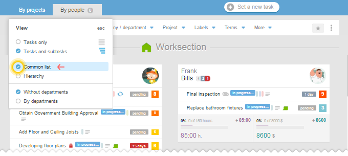
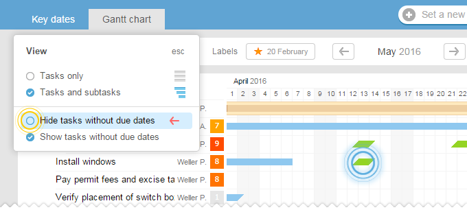
Beautiful and very informative thanks to the detailed description of parameter’s options. Have you seen something new? Hover over (i) sign and learn more.
Note: we disabled account’s admins from seeing questionable option of «looking at hidden info». If your company needs it, contact us.
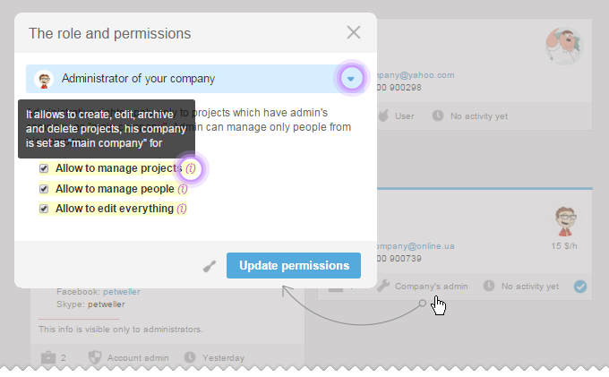
new In the section All projects, cards have become more functional. Both Active and Dormant projects are now together, while Archive is in a separate tab. Now there’s also the Me filter that helps you to understand who is participating/ not participating in which projects.
new All tasks section. When you use task access by projects and sorting, there is always a question that can come to mind. Which project with its tasks should be at the top and which should be at the bottom? There are different approaches to answering this question. Now you can choose your own way of ordering the projects. You can find all details in (i)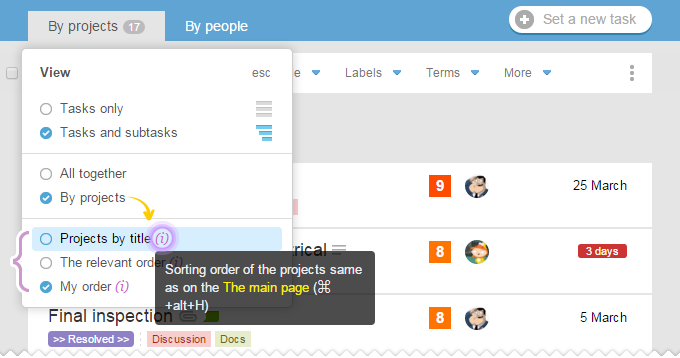
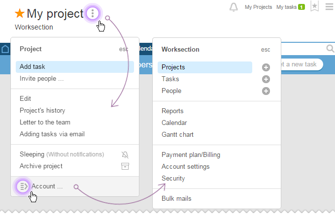
new At the header of each page, there are three periods after the name that contain menus of the Account / Project / Task with their new options. Moreover, from the Project’s menu, for instance, you can move one level up to the Account’s Menu. It means that from any page of the system you can move to another one without even using hotkeys.
 there’s now a big button Help that can be accessed by simply clicking F1 on a keyboard. Exit, if used by you previously, is now at the very bottom to the right.
Dear Friends, this is all for now. We hope that all these newbies will help you work with even more comfort and productivity. As usual, we are looking forward to your comments and feedback along with brilliant ideas and suggestions.
