
What’s up, friends?!
We are happy to introduce an updated interface and multiple user and functional improvements. New design is already in your accounts!
Let’s try to predict top 5 questions of the first encounter with the redesign and answer them
1. Why did you do that?
We’ve discovered that bulky floating header with multiple UX problems can no longer be satisfying: neither visually nor technically. Moreover, it does not allow to fulfill all of our ideas. Many years it served us faithfully, but it is time to move on.
- We optimized the layout of information and decreased the overall height approximately twofold, which enables us to stay away from transformations and fixate the header on all the pages
- We bid farewell to the blue color giving preference to contrasting elements on the white background
- Redesigned the icons
- Combined Create Project /Task /Invitation buttons in one
- Implemented the search and result output on all lists in one spot (projects + archive + tasks + done + people + bookmarks)
Now everything is easy and in contrast,
reserved and functional
2. Where’s the account section?
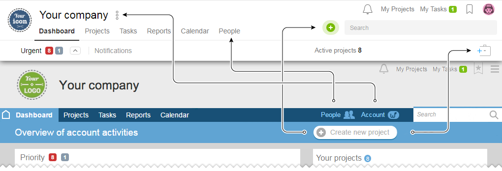
- Access to the Account sections is in the drop-down menu (
 )
)
right behind the name of your company - People Section moved to the Calendar
- Creating new project is now possible from two places
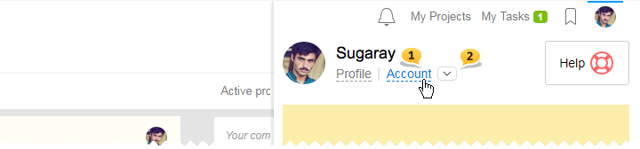
Please, note that in the top right-hand corner, in the place of the hamburger menu, is your avatar. Functionality remains the same.
3. Where is my logo?
When working on the header redesign, we had to change the format of the uploaded logos. If earlier there was an option to use rectangular pictures with the 3:1 ratio, then now it has to be plus-minus square with the 1:1 ration. If your logo was not of square shape, then, unfortunately, it will no longer be reflected within the account; however, it will still remain the same on the login page till you download the new version. We truly hope that you will forgive us for any inconveniences it may cause. We will ensure not to do anything like that in the future.
Minimum recommended size of the company icon to be uploaded or the icon of the group of projects — 96×96 px. This is the size that will be used on Retina displays, and for regular displays — it will show its minimized version of 48×48 px.

Advice the uploaded icon should not contain the name of your company because the name from the “Account Settings” is now always reflected and cannot be hidden as earlier.
Upload of the new icon of the company is now possible by using the drag-&-drop features. Again, accept our apologies…
4. Where is the “Create new project” button?
Advice if you wish to create tasks skipping the drop-down menu of options — just use double click.
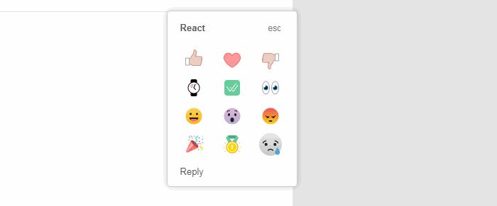
5. Is there anything that I reaaaaally need?
Absolutely! We added three new reactions: Party, Medal, Sad face ;-)

Other updates which we will be covered in the series of next blog posts:
- Combined button of Create, Tasks, Invitations — Green Plus
- Search of all the elements of the lists My menu and others
- Transliteration of the search entries
- Quick adding of subtasks “in one click”
- Markdown markup in the quick form of commenting
- Minimization and asynchronous spin of the right column
- Correct flip and measurement of the photos
- Updated view of the Files section by the list
- New page — all files of the task
- Restriction on the number of the displayed data
- Change of the project and level of nesting at task setting
- Additional upload of new comments, checklists, and emotions to the feed
- Integration with Telegram
p.s. number 13 will be available for your reading pleasure in our blog on Halloween