
We continue spreading the great news about the spring update. And as you have probably already guessed, this time we will cover the application.
Lately we have been often accused that the app does not keep up with the spirit of time, glitchy, has unclear navigation, and, generally, it is more convenient to work through the mobile browser… We admit it — all of those claims were fully justified, and, yes, it is quite convenient to work through a web browser on your cell phone ;-)
Update your application in AppStore or Android Market right now and you will surely not regret it!
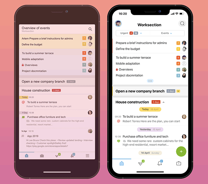
How it was / How it is
In the picture below, you can compare how the home account looks in the old and the new versions.
- Increased the size of the fonts and icons
- Got rid of burger-menu by reducing the number of items in the bottom panel to four and made this menu identical for all the sections
- Inserted a large green plus sign to add Projects / Tasks / People
- Tied the commentary form to the bottom of the screen (on the pages where there are comments)
- Created a big and convenient page for full-fledged commentary
- Implemented support for full-screen devices with the “monobrow”
- Added the dark theme
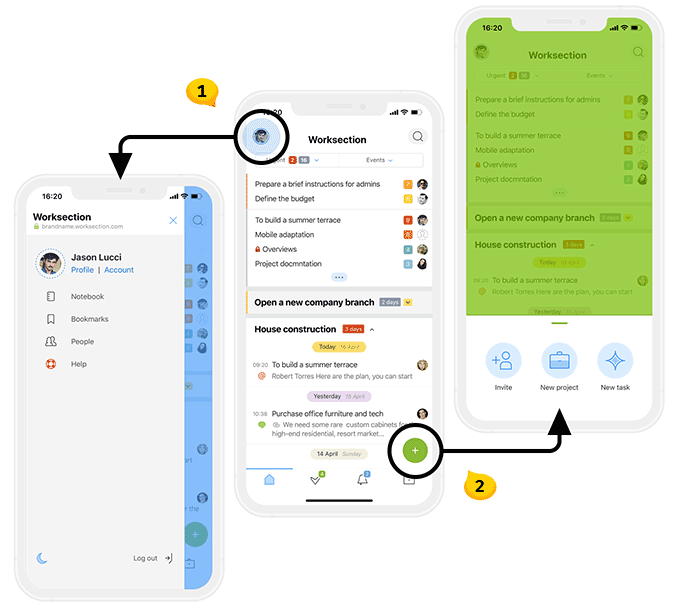
Navigation
- The side menu new
Your avatar is now a hiding place for all the items that used to be in the burgermenu (three bands) in the old application. There is also a Crescent icon that allows switching to the Dark theme. Menu can be collapsed by swiping to the side. - The green plus new
This large green Plus is now available on all pages New New of the aplication with the exception of those that has commentary enabled. Menu can be collapsed by swiping down.
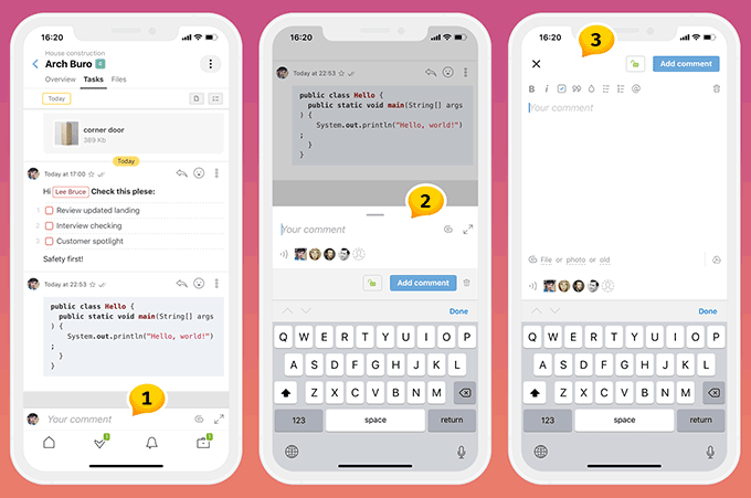
A brief and the full comment form
The pages of the detailed view of the job no longer require to scroll down till the very end to leave a comment. Because the comment form is now always visible and accessible at the bottom of the screen.
- Comment form start is now tied to the lower part of the screen
- Brief comment space above the feed
- Full-fledged comment form on the entire screen of your device
Note: Switching from the brief comment form2 to the full comment form3 can be done by clicking on the icon or simply moving your finger to the position 2.
Friends, this is all for today. We are very grateful for your feedback, which helps us focus on daily problems you encounter. Together we make Worksection better.
Have a productive work time!
The Worksection Team